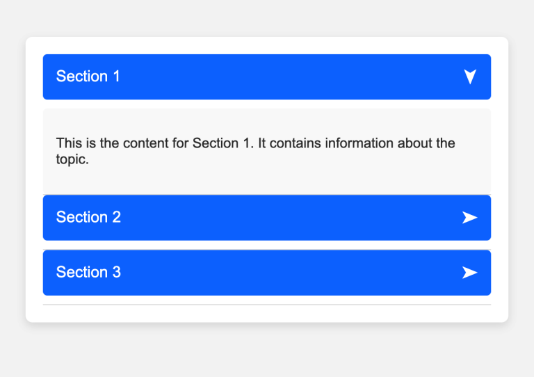
Accordion Component Example
This is a simple accordion design that helps in expanding and collapsing sections of content. Each section can be toggled open or closed by clicking on the section header. This layout is commonly used in FAQs, navigation, and content organization to keep the page clean and user-friendly. The accordion is...


